Listening to your community
This discussion about the new JQuery website is pretty interesting. Just to recap, their old site looked like this (click these to big, if you want):

On Friday, they changed it to look like this:
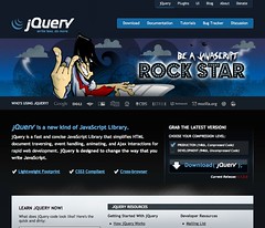
...and their community went pretty wild. They particularly didn't like the use of the rock star image and metaphor. So they decided to change it to this:

For me, this all smacks of a badly thought through process, and they're still not thinking smartly.
I'm inclined to draw comparison with another recent failure to engage properly with a community - the unveiling of the London 2012 logo. In both cases, there was an opportunity to canvas opinion with the audience, and this option was ignored (or, worse, not even considered). In both cases it backfired badly.
JQuery has no excuse for not engaging with their community before going down this path. Their community lives on the web, where there are well established tools for seeking, gathering and processing feedback. Try and slip one past this crowd at your peril - just ask Kevin Rose after the encryption key debacle or Mark Zuckerberg after the Beacon mess.
And that isn't to say that the quick change was the best way forward either (although some members of the community appreciated it). For me, this merely repeats and compounds the error. At least the London 2012 guys didn't fall into this trap (although they shouldn't have just left things the way they were either!).
What I think both the JQuery team and the London 2012 team should have done is recognise that community engagement is difficult, messy, time consuming....and very worthwhile, especially if done during the discovery phase of a project. It's also a good way to reverse an error, if accompanied by a well-timed mea culpa. In today's highly connected world, the onus is on public leaders to demonstrate that they've thought things through, but still need the input and support of their community to make the big decisions.
For the JQuery case study, I believe the best path forward would be to outline the logic behind the redesign - what are the objectives of the website? How will they achieve these objectives? - and then present options for the community to consider. Then they need to demonstrate that they're listening, and not just say that they are. If they can do this, then those who don't like the final solution are far less likely to object than if a seemingly arbitrary solution is thrust upon them.

On Friday, they changed it to look like this:

...and their community went pretty wild. They particularly didn't like the use of the rock star image and metaphor. So they decided to change it to this:

For me, this all smacks of a badly thought through process, and they're still not thinking smartly.
I'm inclined to draw comparison with another recent failure to engage properly with a community - the unveiling of the London 2012 logo. In both cases, there was an opportunity to canvas opinion with the audience, and this option was ignored (or, worse, not even considered). In both cases it backfired badly.
JQuery has no excuse for not engaging with their community before going down this path. Their community lives on the web, where there are well established tools for seeking, gathering and processing feedback. Try and slip one past this crowd at your peril - just ask Kevin Rose after the encryption key debacle or Mark Zuckerberg after the Beacon mess.
And that isn't to say that the quick change was the best way forward either (although some members of the community appreciated it). For me, this merely repeats and compounds the error. At least the London 2012 guys didn't fall into this trap (although they shouldn't have just left things the way they were either!).
What I think both the JQuery team and the London 2012 team should have done is recognise that community engagement is difficult, messy, time consuming....and very worthwhile, especially if done during the discovery phase of a project. It's also a good way to reverse an error, if accompanied by a well-timed mea culpa. In today's highly connected world, the onus is on public leaders to demonstrate that they've thought things through, but still need the input and support of their community to make the big decisions.
For the JQuery case study, I believe the best path forward would be to outline the logic behind the redesign - what are the objectives of the website? How will they achieve these objectives? - and then present options for the community to consider. Then they need to demonstrate that they're listening, and not just say that they are. If they can do this, then those who don't like the final solution are far less likely to object than if a seemingly arbitrary solution is thrust upon them.
Comments
By pushing something out there that was different, exciting, dramatic, they created an engaging event.
I agree that there are better ways to do such things, but I don't think it was that bad and I would hate for every community that has a few users to be get too frontloaded on every process.
So for this website, they could've released their early prototypes for review (alongside their rationale), and very early on discovered that the rock star thing was going to generate stiff resistance.
I've been careful not to offer my opinion on the design of the site itself - although I have views on that, this blog post is just about the failure to engage with the community in a timely fashion. I think they've failed to release early or often.